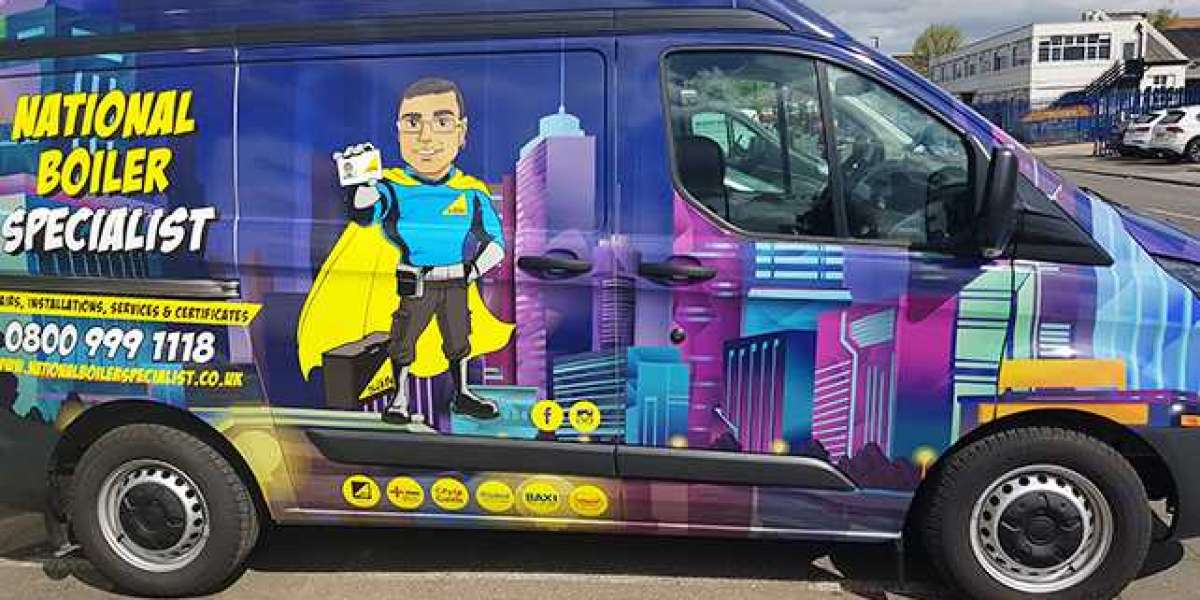
When a van drives by on a busy road or waits at a red light, it becomes a moving advert—an opportunity to show off your brand. But how much of your message actually sticks with people when they see your van for just a few seconds?
Designing van signage isn’t just about putting your logo on the side of a vehicle. It’s about creating a clear, eye-catching, and memorable message that people can read in motion. In this blog, we explore practical design tips to ensure your van signage stands out, stays readable, and leaves a lasting impression—no matter the speed.
Understanding How We See Things in Motion
To design van signage that works, we first need to understand how people see moving objects.
Most people only have 3 to 5 seconds to glance at a moving vehicle. The further away they are, the less detail they can see. For instance, from 50 metres away, small text or complicated images become a blur. Our eyes naturally focus on larger shapes, bold text, and high contrast areas first.
This means that simplicity, size, and colour play a big role in whether someone notices your van signage—or not at all.
The Rule of Three: Keep It Simple
One of the most common mistakes in van signage is trying to say too much. In reality, people don’t have time to read a long message when your van is moving.
The "Rule of Three" is a great way to keep your message short and sharp:
- Logo or Brand Name – Who are you?
- Tagline or Core Message – What do you do?
- Call to Action – How can they reach you?
Avoid listing every service, certification, or team member. Keep it clean and focus on the message that matters most.
Fonts That Work at Speed
Not all fonts are created equal—especially when it comes to readability from a distance and at speed.
Use clear, sans-serif fonts like Arial, Helvetica, or Futura. These fonts are easy to read and don’t have extra details that become hard to see when your van is in motion.
Make sure your font size is big enough. A good rule of thumb is that each 2.5cm of letter height equals about 3 metres of readability distance. So, if you want someone to read your company name from 30 metres away, the letters should be at least 25cm tall.
Avoid using fancy script fonts or thin lines. These can become unreadable quickly, especially in bad weather or bright sunlight.
Contrast and Colour: Make It Pop
Contrast is one of the easiest ways to improve van signage visibility. Think black text on a white van, or white text on a navy-blue background.
Choose high-contrast colour combinations that are easy on the eyes. Some tried and tested combinations include:
- Black on yellow
- White on blue
- Red on white
Avoid combinations that strain the eyes or blend together, like red on black or green on blue.
Also, think about your brand colours. They should be strong enough to stand out but still represent your business. A good balance between branding and visibility is key.
Logo Placement and Size Matter
Where you place your logo and how big it is can greatly affect visibility. Your logo should be:
- Big enough to be seen from a distance
- Clear and uncluttered
- Placed logically on all sides of the van
Ideal spots include the side panels, the rear doors (which people see when stuck in traffic behind you), and the bonnet.
Leave enough empty space around your logo. This helps draw attention and avoids visual clutter. Don’t stretch or distort the logo to fit—it should always look sharp and professional.
Layout That Works on the Move
Movement changes how we process images. For van signage, it’s best to stick with horizontal layouts. These are easier for the eye to scan quickly compared to vertical or angled text.
Make sure the most important information is at eye level and in the central part of the panel. Avoid crowding the design with too many elements.
Also, think about the shape and features of your van. Work with them, not against them. Use flat spaces and avoid placing text where it will be cut off by door handles, windows, or wheel arches.
Icons or simple graphics can also help explain what your business does—especially if your name doesn’t make it obvious. Just don’t overload the design with too many pictures.
Testing: Weather, Light Speed
Designing great van signage doesn’t stop at the drawing board. It’s important to test your design in real life.
- Take your van outside in different lighting conditions—sunny, cloudy, at night.
- Look at it from different distances and angles.
- Drive it past a friend or colleague and ask them what they noticed.
This helps make sure your signage is readable in all kinds of situations. It’s also worth checking how your signage looks in wet or dirty conditions, as roads aren’t always clean and dry.
Good signage companies often provide mock-ups or even digital previews, so you can see what the final result will look like on your specific van.
Mistakes to Avoid in Van Signage Design
To recap, here are some of the most common errors made in van signage:
- Too much text – Hard to read, easy to ignore
- Small font sizes – Can’t be seen from a distance
- Poor contrast – Colours that blend together or strain the eyes
- Low-quality graphics – Pixelated images or stretched logos
- Bad layout – Important info hidden behind features of the van
By avoiding these pitfalls, you’ll make sure your signage looks professional and gets your message across clearly.
Conclusion: Your Van Is a Moving Billboard
Van signage is a powerful way to advertise your business while on the move. Whether your van is parked or stuck in traffic, it has the potential to catch the eye of countless new customers every day. To maximise this, keep your design simple and clear with large fonts, high-contrast colours, and a logical layout that’s easy to read at a glance. Testing your design in real-life situations is essential. For professional results, trust expert signage companies. Sign Company London provides specialist van signage services—from design to installation—ensuring your brand stands out and makes a lasting impression.
![Aluminum Die Casting Machinery Market New Opportunities [2023] | Restraints and Trends | Forecast to [2030]](https://youslade.com/upload/photos/2023/09/aDOzEnwWFMYbeIG8HK7f_06_ba3771ddcf75d15dee4c31078814ce15_image.jpg)
